If you’ve followed Cerulean Sanctum for a while, you know that the blog got a facelift last week, with more tweaks having come this week.
One of the major new features is that I’ve gone with the typography I like, a combo of the Carolingia and Fontin Sans fonts. Those are not typical, Web-safe fonts, but you see them because of recent CSS protocol updates and newer browsers that interpret the @font-face command.  This allows remote loading of fonts that may not have been installed locally on the surfer’s computer. By caching them on the server and in the browser, they load quickly. As this is a recent capability of modern browsers, if you would like to know more—especially about the travails and gotchas with embedding fonts—leave a comment. (If the page you are seeing doesn’t resemble the image at right, let me know. I have not tested for Internet Explorer 6 or Google Chrome, which I have heard both have some issues with @font-face. As for IE 6, please dump that dog right away and at least go to IE 7, though 8 is available.)
Cerulean Sanctum now runs the Sophia child theme for Thematic, a modern theme framework. Highly search engine optimized, this theme should return better, higher-ranked results in Google and Bing. And trust me, I’ve been looking at themes for a few years now, so finally finding a theme that was simple yet powerful and with solid SEO was a chore.
More than anything else, I wanted to improve the loading times and readability of the blog. The text is larger than before and with better whitespace use. Speed boosts come from the more efficient theme, killing some sidebar stuff no one used, some tinkering by me on the back end, and switching from WP Super Cache to W3 Total Cache. Altering the future expires settings and some other .htaccess file tricks also help. (If you would like to know more about tweaking WordPress blogs, please leave your question in the comments below.)
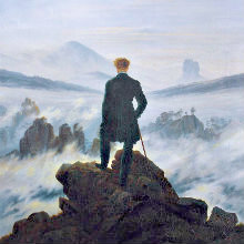
If you have any feedback, please let me know! Especially if what you see looks bad or wrong. I already altered the header image because some folks were “blinded” by the graduated transition from white to blue, so I hope that helped.
A few minor tweaks are still in the works, but I’ve already spent considerable time on the upgrade and other duties call.
Thanks for being a reader.
Dan,
Ok, starting from the top: I like the new Logo and title Font. Just not so crazy about the colors. While I dig the clouds I think the white font gets lost in the shuffle. The header tagline, “looking for a 1st century church…et al” font is too small and perhaps needs to match the body text. Also the light blue sub-titles are weak. I’d go with a darker shade to help them pop more. The body text is great and is definitely more readable.
Keep the good work.
Graham,
Which colors do you not like? The cerulean has to stay (obviously), and there’s only five other colors (three grays, a tan, and a darker blue/green).
I don’t lose the blog name in the clouds on either my CRT or my LCD monitor. I wonder if it is a monitor gamma issue peculiar to some folks’ monitors. I may have to find a different banner if I can’t rectify it otherwise.
BTW, at what resolution are you viewing this?
Graham,
I pumped up the blog description/tagline by 0.1em. It’s now the same size as the body text, though in a slightly lighter color.
i like it … visually, it’s easy to read and too many bloggers miss that point …
Rick,
No doubt!
Much more readable. The titles do get lost in the clouds, but as I know where I’m going, that’s not as big an issue for me as it might be for a reader finding you via a search engine.
As always, I visit for the content, which provokes thought and discussion on board Sea Venture!
Thanks for the feedback, Normandie. As to the banner readability issue, what type of monitor are you using (LCD, CRT, etc.) and at what resolution is it set?
Hi Dan,
I do like the look overall.
A few minor critiques:
I don’t like the font for the Cerulean Sanctum title and for the post titles. It seems too fancy (makes me think I’m about to read some Shakespearean prose) and is difficult to read.
Also the white color of the Cerulean Sanctum title text is hard to read over the background image. Perhaps a drop shadow would fix that.
Regardless, I love your blog Dan. It has truly been a sanctum for me!
I tried to post a comment earlier, but it seems to have disappeared 🙂
I like the look overall, but the font used in the header and titles is a bit hard to read and seems too much of a fancy, Old English style for my taste. I also think a drop shadow on the header text would make it stand out a bit from the clouds.
Actually, Jeff, there may have been just a bit o’ lag on the comment because of caching. Some things will show up in a couple minutes, but perhaps not instantly.
I like the Carolingia font for its “illuminated manuscript” look, which is what I was trying to achieve. I will see if I can put a CSS drop shadow on the title, as I was considering that anyway.
Jeff,
The text-shadow CSS call will now add a great-looking drop shadow on the title in compliant browsers. Sadly, it does not work in any version of IE.
Just another reason to abandon IE.
I like the font very much, but on my screen, at least (Acer netbook set to 1024 x 600 w/32 bit color), the light blue post titles are hard to discern against the white background. Also the white-on-cerulean-and-white of the banner is a hard to discern. Yes, the whitespace is good, but the text-to-background lack of contrast is a little hard on the eyes. Peace.
Milton,
If you’re using Firefox, Opera, or Safari, I fixed the legibility of the title of the blog by adding a drop shadow. Sadly, IE does not support this and the fix appears to involve a lot of work.
As for improving the legibility of the post and sidebar titles, I will have to look into that. Everything looks fine on my end, but I acknowledge that no person has the exact same viewing experience.
Yes, I’m using Firefox, and the drop shadow works nicely on the banner. I’m also seeing a different, less ornate font on both the banner and post titles.
Dan,
I don’t know if it’s just my browser (Firefox), but I find the post titles hard to read. I shouldn’t have to work to read them but should be able to read them instantly at a glance, even if I’m not looking directly at them, which I definitely can’t do. Even the text of the posts seems harder to read than before, although that may only be because the double-spacing is a little too much space between lines to follow. (Maybe try 1.5 spaces? I think that’s what a lot of book publishers are using now. Something in between what you have on the blog and what you have here in the comments.) The italics of the new font are harder for me to read as well; they seem to lean over so far I feel like I need to tilt my head to read them! That may also be, however, because of the double spacing.
Sorry to be the lone stinkbug here. 🙁
Dan, the site looks great in Google Chrome!
Joel,
That’s great to know. I’m assuming then that the font faces (Carolingia and Fontin Sans) are loading properly? I had read in several places that Chrome didn’t always render them correctly.
Actually, the shadow on the title isn’t showing up on Chrome, but the font looks good…it has an outline around it. On Firefox 3.5.8 the shadow looks good, but the font failed to download apparently (it’s showing in the browser’s standard serifed font). The blue font (post titles) also did not download for my version of Firefox. I’m behind a firewall at work. I could try later this weekend…
Joel,
That’s weird about defaulting to the standard font. All the replacement fonts are cached at the server level then at the browser level. They are also GZIPed by the server for faster download times (each of the two runs at 18K GZIPed, so between that and caching, they should load almost immediately, even from a clean browser hit). A firewall shouldn’t stop them, either.
I can’t give you an answer on this.
Just a quick qualification, I’m looking again, and the font of the posts really is quite clear and easy to read. In the interest of full disclosure, I should also mention that I had a major head injury long ago that, while not noticeably affecting my daily life on the whole these many years later, still makes it a little extra work for me to follow text over a period of time, which is also probably why I’m more sensitive to the line spacing issue. As others don’t seem to have any trouble with it, I think you’re safe to chalk my earlier comments up to “much ado about nothing.”
The content of the blog, outstanding as it is, is slightly more important anyway. 🙂
Vince,
I increased the size of the Carolingia font (in the color cerulean) since the time you first posted. Glad to hear that it works better now for you! I also reset the caches and switched to a slightly different rendering of the Fontin Sans font, which may be why the post text looks better now.
Yeah, I said I was going to stop tinkering, but it seems I can’t! 😉
I like it. It’s easy to read.
Great, Sonya! Thanks for the feedback.
Yeah, can’t read most of it off Chrome. You’d have to see for yourself, because I don’t know the tech words.
The site loaded faster. which I understand was one of your key objectives.
That’s odd, Bene D. I’ve been getting positive feedback from Chrome users.
Hey Dan,
u will always get positives and negatives w/ change.
people will get used to whatever u do, and new lookers won’t know…
having said that, the eye presentation of the site, to me, appears a bit washed out–have to squint at it a little more.
keep up the good work!
Joe L.
Joe,
I think that some people have the backlighting cranked on their LCD monitors so that color saturation ends up losing out. If I turn the brightness up, I always counter that by adjusting the contrast.
thanks!
Dan:
First of all, a welcome change. There must be a character limit on the “Name” field in the post a comment section because I could not get the full title “Onward, Forward, Toward…” without it cutting off.
I have noticed that in Firefox 3.5.9, the font if like a Times New Roman type of font while in Safari 4.0.4 (531.21.10) (Windows Version) and Internet Exploder 8.0.601.17802, the font is the combo of the Carolingia and Fontin Sans font.
What is weird is that in reference to the combo of the Carolingia and Fontin Sans font, The text of your articles look a tad blurry in IE but clearer in Safari while in the comments section, the comments look a tad blurry in Safari but clearer in IE against the grey and tan background. Also, the font looks slightly larger in IE over Safari.
However, it does load considerably faster and is much cleaner than the last template. However, I am concerned that with the very near future release of WordPress 3.0 (now in Release Candidate 1 stage which usually means that they are about ready to roll this version out) will your template (and I have the same concerns with the Arthemia template I am using) that you have gotten tweaked to a comfort level of your satisfaction be able to work with WordPress 3.0? Or do you plan on staying with 2.9 for a very long time?
OFT,
Not sure about the name field length being capped. I guess it’s possible, but I’ve not heard of this being the case before.
Safari seems to render it perfectly every time for me, as does IE. Firefox occasionally flashes quickly between the default font and my custom ones on the first page load or if I have a ton of tabs open.
Some of the issue with the fuzziness of the font is a ClearType or anti-aliasing issue. Different browsers handle this differently, and none are consistent because people turn this feature on and off and don’t realize it. I always like ClearType off; the fonts are more jagged, but you lose a bit of that haziness that ClearType creates.
One of the reasons I went with Thematic as the parent theme is that it is written by Ian Stewart, who just happens to be the author of the new default theme for WordPress 3.0, Twenty Ten. For this reason, I think it will be highly unlikely that Thematic will be orphaned or will lag behind in development. As the child theme, Sophia is mostly CSS, so I have even less to worry about (though I absolutely agree with you about some people’s themes going belly-up with the advent of 3.0).
I reckon not many folks like change — but in this case, I believe the content is more important to me than the look.
True, Sulan. But in an age of the rule of search engines, themes matter. Having a fast-loading theme with an emphasis on SEO matters whether that content is found and where it ranks. If people can’t find it, what’s the point of writing it? A lone diamond buried amid 100 tons of dirt might as well not exist.
Not even sure I understand all you answered me — although I am sure others do. I love the content of what you post, so I will continue to come here and read and be blessed by what you write — and by the responses you get.
Sometimes I find I am so mired in my own view, and I get excited when someone presents a different one, and I get to investigate theirs.
Just thanks!
Dan,
One of the worst things aboutthe depression that I have been onder for the last six months is not being able to come and read your blog and benefit from your wisdom.
I’m glad I’ve been able to stop by, the new design is VERY pretty!
Keep it up!
Peter,
I am very sad to hear that that you have been struggling. I just now prayed for you!
Thanks for the statement about the redesign.