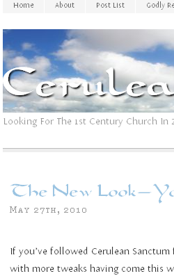
If you’ve followed Cerulean Sanctum for a while, you know that the blog got a facelift last week, with more tweaks having come this week.
One of the major new features is that I’ve gone with the typography I like, a combo of the Carolingia and Fontin Sans fonts. Those are not typical, Web-safe fonts, but you see them because of recent CSS protocol updates and newer browsers that interpret the @font-face command.  This allows remote loading of fonts that may not have been installed locally on the surfer’s computer. By caching them on the server and in the browser, they load quickly. As this is a recent capability of modern browsers, if you would like to know more—especially about the travails and gotchas with embedding fonts—leave a comment. (If the page you are seeing doesn’t resemble the image at right, let me know. I have not tested for Internet Explorer 6 or Google Chrome, which I have heard both have some issues with @font-face. As for IE 6, please dump that dog right away and at least go to IE 7, though 8 is available.)
Cerulean Sanctum now runs the Sophia child theme for Thematic, a modern theme framework. Highly search engine optimized, this theme should return better, higher-ranked results in Google and Bing. And trust me, I’ve been looking at themes for a few years now, so finally finding a theme that was simple yet powerful and with solid SEO was a chore.
More than anything else, I wanted to improve the loading times and readability of the blog. The text is larger than before and with better whitespace use. Speed boosts come from the more efficient theme, killing some sidebar stuff no one used, some tinkering by me on the back end, and switching from WP Super Cache to W3 Total Cache. Altering the future expires settings and some other .htaccess file tricks also help. (If you would like to know more about tweaking WordPress blogs, please leave your question in the comments below.)
If you have any feedback, please let me know! Especially if what you see looks bad or wrong. I already altered the header image because some folks were “blinded” by the graduated transition from white to blue, so I hope that helped.
A few minor tweaks are still in the works, but I’ve already spent considerable time on the upgrade and other duties call.
Thanks for being a reader.
